A cool Lemmy
  • Communities
  • Create Post
  • Create Community
  • heart
    Support Lemmy
  • search
    Search
  • Login
  • Sign Up
The Picard Maneuver@piefed.world to Mildly Interesting@lemmy.worldEnglish · 21 days ago

A different perspective

media.piefed.world

message-square
64
link
fedilink
1

A different perspective

media.piefed.world

The Picard Maneuver@piefed.world to Mildly Interesting@lemmy.worldEnglish · 21 days ago
message-square
64
link
fedilink
alert-triangle
You must log in or register to comment.
  • Ksin@lemmy.world
    link
    fedilink
    arrow-up
    0
    ·
    20 days ago

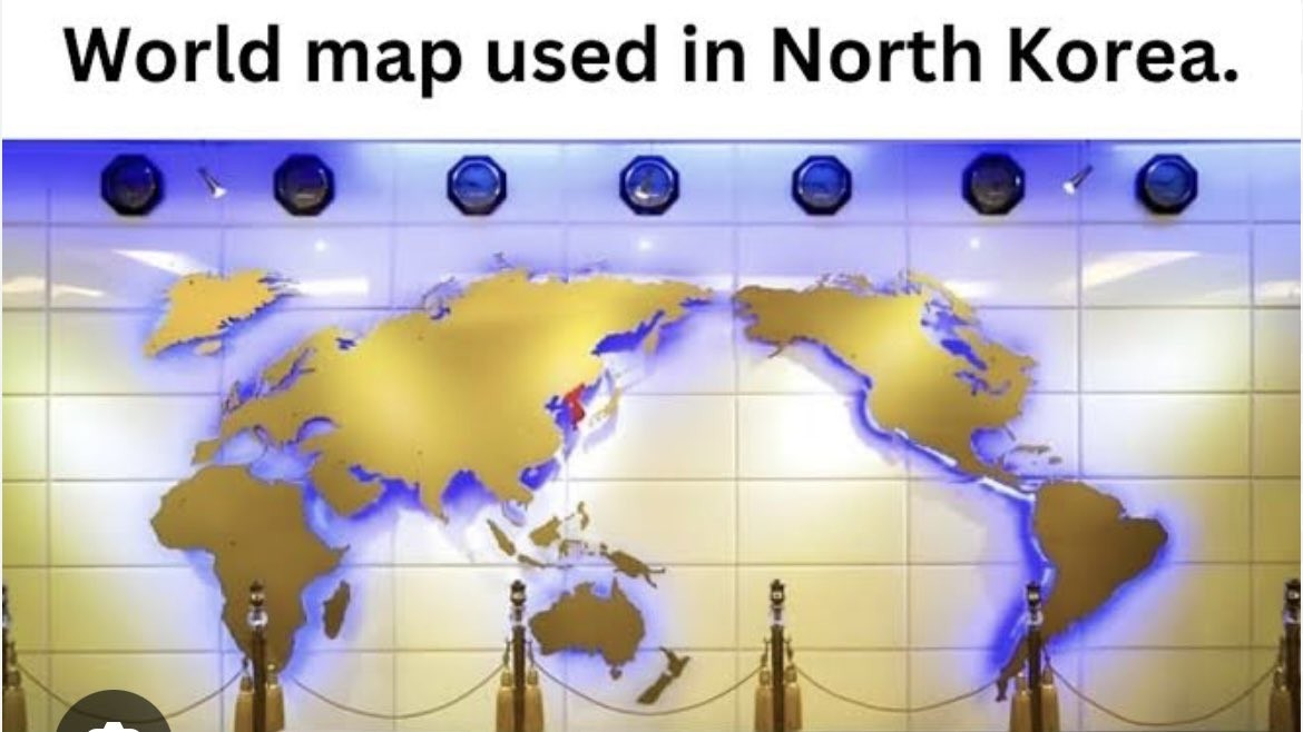
    At first this map seemed perfectly fine to me, but the more I look the weirder it gets.

    • The projection used (Mollweide?) distorts the hell out of Europe, Iceland is practically a smear.
    • Thailand is gone.
    • Crimea seems missing.
    • Is Japan a bit shrunk?
    • They must have screwed up mounting Africa because the Red Sea and Gulf of Aden are WAY too big
    • x00z@lemmy.world
      link
      fedilink
      English
      arrow-up
      0
      ·
      19 days ago

      They also claim South Korea.

  • wewbull@feddit.uk
    link
    fedilink
    English
    arrow-up
    0
    ·
    20 days ago

    Seems odd to me to want to put the largest ocean in the world as the focus. Yes, let’s put most of the useful information around the edge of the map. Brilliant idea.

    Let’s draw maps with Antarctica in the middle instead.

    • HubertManne@piefed.social
      link
      fedilink
      English
      arrow-up
      0
      ·
      20 days ago

      north korea is pretty lose to center on the map.

    • XeroxCool@lemmy.world
      link
      fedilink
      arrow-up
      0
      ·
      20 days ago

      That’s just the back of the UN logo

  • scytale@piefed.zip
    link
    fedilink
    English
    arrow-up
    0
    ·
    20 days ago

    Most maps in Asia are like this. That’s why growing up I was confused why the US was called the west and East/Southeast Asia was called the far east.

    • toynbee@lemmy.world
      link
      fedilink
      arrow-up
      0
      ·
      edit-2
      20 days ago

      XKCD comic pointing out that the West and East are mislabelled

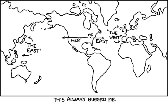
      edit: Oops, didn’t realize the credit wouldn’t be obvious. It’s xkcd #503.

      • _stranger_@lemmy.world
        link
        fedilink
        arrow-up
        0
        ·
        edit-2
        20 days ago

        I guess it kinda makes sense if you draw the line right down the middle of Germany. Weird, I wonder if there’s any historical precedent for that…

        • mapleseedfall@lemmy.world
          link
          fedilink
          arrow-up
          0
          ·
          20 days ago

          Its almost as if some country thinks they are the center of the world.

          • ilinamorato@lemmy.world
            link
            fedilink
            arrow-up
            0
            ·
            20 days ago

            Well, specifically a couple of countries on either side of the Atlantic.

            • NiHaDuncan@lemmy.world
              link
              fedilink
              arrow-up
              0
              ·
              20 days ago

              It’s more like most countries. Maps like the one shown in this post that place Asia as a central focus are common in Asia.

              Maybe it’s not national narcissism, rather just focusing on what’s most relevant to any one people.

  • SleeplessCityLights@programming.dev
    link
    fedilink
    arrow-up
    0
    ·
    20 days ago

    Maps with New Zealand.

    • dellish@lemmy.world
      link
      fedilink
      arrow-up
      0
      ·
      20 days ago

      And Tasmania!

  • HazardousBanjo@lemmy.world
    link
    fedilink
    arrow-up
    0
    ·
    20 days ago

    They included New Zealand.

    They’re already leagues ahead of most US primary education text books

  • tonyn@lemmy.ml
    link
    fedilink
    arrow-up
    0
    ·
    21 days ago

    It makes as much sense as any other 2D projection of the globe.

    • teft@piefed.social
      link
      fedilink
      English
      arrow-up
      0
      ·
      20 days ago

      • _stranger_@lemmy.world
        link
        fedilink
        arrow-up
        0
        ·
        edit-2
        20 days ago

        In this map’s defense, it really highlights the value of a northwest passage and all the canals.

      • SethranKada@lemmy.ca
        link
        fedilink
        English
        arrow-up
        0
        ·
        20 days ago

        I like this one

      • Jerb322@lemmy.world
        link
        fedilink
        arrow-up
        0
        ·
        20 days ago

        Maybe a little more than this one…

      • Gonzako@lemmy.world
        link
        fedilink
        arrow-up
        0
        ·
        20 days ago

        thank god I needed a map with an inverse relationship with population and size on the map

    • Pechente@feddit.org
      link
      fedilink
      arrow-up
      0
      ·
      20 days ago

      Doesn’t the US sometimes use one that puts America in the center and cuts Eurasia in half? Can we agree this one is definitely stupid?

      • lurch (he/him)@sh.itjust.works
        link
        fedilink
        English
        arrow-up
        0
        ·
        20 days ago

        where to cut is one of the hardest decisions. i am guilty of defaulting to cut through greenland more than any other country when making world map desktop wallpapers.

        • ilinamorato@lemmy.world
          link
          fedilink
          arrow-up
          0
          ·
          20 days ago

          I don’t think it’s that difficult to decide. There’s a lot more room between San Jose, California and Hokkaido, Japan than between Natal, Brazil and Dakar, Senegal; cutting through the Pacific makes the most sense for most applications, I think. Sure, the Bering Strait is pretty tiny, but if you break in the Atlantic you’re going to get a lot of distortion in Greenland (hasn’t it had enough?), mainland Europe, and Brazil.

      • ExistingConsumingSpace@midwest.social
        link
        fedilink
        arrow-up
        0
        ·
        20 days ago

        I’ve never seen that in the US. That is extremely stupid. Typically maps in the US center around the Atlantic/Europe.

        • OneWomanCreamTeam@sh.itjust.works
          link
          fedilink
          arrow-up
          0
          ·
          20 days ago

          From the US: I grew up with a map like this in the dining room. It was super confusing as s a little kid.

      • faythofdragons@slrpnk.net
        link
        fedilink
        English
        arrow-up
        0
        ·
        20 days ago

        This unlocked some memories, wow.

  • mech@feddit.org
    link
    fedilink
    arrow-up
    0
    ·
    20 days ago

    Fun fact: Whether North or South are “up” on a map is also completely arbitrary.

    • estutweh@aussie.zone
      link
      fedilink
      arrow-up
      0
      ·
      20 days ago

      It’s freaking me out!

    • m0darn@lemmy.ca
      link
      fedilink
      arrow-up
      0
      ·
      20 days ago

      Oh god why Mercator?

      • mech@feddit.org
        link
        fedilink
        arrow-up
        0
        ·
        20 days ago

        Mercator really starts to shine when you rotate it by 90 degrees.

        • Burninator05@lemmy.world
          link
          fedilink
          English
          arrow-up
          0
          ·
          20 days ago

          At this point, Africa is almost represented at its actual size.

        • _stranger_@lemmy.world
          link
          fedilink
          arrow-up
          0
          ·
          20 days ago

          This is cursed enough to be an SCP

    • toynbee@lemmy.world
      link
      fedilink
      arrow-up
      0
      ·
      20 days ago

      https://www.youtube.com/watch?v=B14Gtm2Z_70

    • snooggums@piefed.world
      link
      fedilink
      English
      arrow-up
      0
      ·
      edit-2
      20 days ago

      They undercut the message buy putting upside down at the top.

      I had a teacher in high school who always set his globe that had the text oriented to the nearest pole to have the south pole on top. Anyone switching it would start a conversation about how there isn’t a ‘correct’ up direction.

      • iamdefinitelyoverthirteen@lemmy.world
        link
        fedilink
        arrow-up
        0
        ·
        20 days ago

        There is only a “correct” up direction if it has words. The “correct” up would be the direction of the letters.

    • Lorem Ipsum dolor sit amet@lemmy.world
      link
      fedilink
      arrow-up
      0
      ·
      20 days ago

      Yeah, but European borders aren’t

      • captainlezbian@lemmy.world
        link
        fedilink
        arrow-up
        0
        ·
        20 days ago

        Sure they are, they’re fun to redraw too. I thought y’all loved doing that

    • altphoto@lemmy.today
      link
      fedilink
      arrow-up
      0
      ·
      20 days ago

      Or left right

      • Bgugi@lemmy.world
        link
        fedilink
        arrow-up
        0
        ·
        20 days ago

        Should have rotated the other way so the sun scrolls satisfyingly top-to-bottom.

    • Jankatarch@lemmy.world
      link
      fedilink
      arrow-up
      0
      ·
      20 days ago

      This looks like a fantasy world map wtf.

  • RandomStickman@fedia.io
    link
    fedilink
    arrow-up
    0
    ·
    20 days ago

    The oddest part for me is Greenland being split from the Americas

    • 𝙲𝚑𝚊𝚒𝚛𝚖𝚊𝚗 𝙼𝚎𝚘𝚠@programming.dev
      link
      fedilink
      arrow-up
      0
      ·
      edit-2
      20 days ago

      I mean politically speaking it’s Danish, so I suppose it makes sense to group it with Europe in some ways.

      It does look a little odd though.

  • Lemminary@lemmy.world
    link
    fedilink
    arrow-up
    0
    ·
    20 days ago

    I like it, if only because it places Oceania at the center. They’re always pushed aside and it’s big sad.

  • Chezus9247@lemmy.world
    link
    fedilink
    arrow-up
    0
    ·
    21 days ago

    Sea of Thieves lookin’ map.

  • kelpie_returns@lemmy.world
    link
    fedilink
    arrow-up
    0
    ·
    20 days ago

    Friar tuck with a splash of bird turd to the noggin

  • Colonel_Panic_@eviltoast.org
    link
    fedilink
    arrow-up
    0
    ·
    20 days ago

    At least it has New Zealand.

  • OfCourseNot@fedia.io
    link
    fedilink
    arrow-up
    0
    ·
    20 days ago

    Don’t the rest of the countries in the region use similar maps? South Korea, Australia, Japan…? I would expect that to be the case, it seems more natural.

    • muhyb@programming.dev
      link
      fedilink
      arrow-up
      0
      ·
      20 days ago

      Yes, and Australia even has it as upside down.

  • A_norny_mousse@feddit.org
    link
    fedilink
    arrow-up
    0
    ·
    edit-2
    20 days ago

    There is no North Korea in North Korea. There is only Korea.

    • Bgugi@lemmy.world
      link
      fedilink
      arrow-up
      0
      ·
      edit-2
      20 days ago

      Nerd sniped me enough to look it up. Both countries use different names for “all of korea.” While the north generally refers to itself with the same term as all of korea, there are some contexts where there is a “north Korea” used.

      • A_norny_mousse@feddit.org
        link
        fedilink
        arrow-up
        0
        ·
        edit-2
        19 days ago

        Nerd sniped me

        The fuck’s wrong with you? (I guess that wasn’t directed at me)

        Look at the pic, all of Korea is red.

  • NigelFrobisher@aussie.zone
    link
    fedilink
    arrow-up
    0
    ·
    20 days ago

    It makes sense they’d centre the Gulf Of Korea though.

Mildly Interesting@lemmy.world

mildlyinteresting@lemmy.world

Subscribe from Remote Instance

Create a post
You are not logged in. However you can subscribe from another Fediverse account, for example Lemmy or Mastodon. To do this, paste the following into the search field of your instance: !mildlyinteresting@lemmy.world

This is for strictly mildly interesting material. If it’s too interesting, it doesn’t belong. If it’s not interesting, it doesn’t belong.

This is obviously an objective criteria, so the mods are always right. Or maybe mildly right? Ahh… what do we know?

Just post some stuff and don’t spam.

Visibility: Public
globe

This community can be federated to other instances and be posted/commented in by their users.

  • 4 users / day
  • 15 users / week
  • 262 users / month
  • 305 users / 6 months
  • 0 local subscribers
  • 23.3K subscribers
  • 79 Posts
  • 403 Comments
  • Modlog
  • mods:
  • marcar@lemmy.world
  • Jimbabwe@lemmy.ml
  • WhatsHerBucket@lemmy.world
  • Zerlyna@lemmy.world
  • UI: unknown version
  • BE: 0.19.11
  • Modlog
  • Instances
  • Docs
  • Code
  • join-lemmy.org