

You must log in or # to comment.
This is ridiculous and I hate it.
I have no idea what must be wrong with someone’s eyes to call that dress white and gold. I mean it was always a stretch, the shadow/lens on top of it would have to be fucking BLUE to color it something similar.
Even then it sounds stupid to go with that stretch of it being white and gold.
My working theory is that people who saw it gold and white were exposed to lead.
I was exposed to lead and yet I only saw blue and black.
There goes my theory! Damn! :)
Shadows do generally overrepresent the color blue due to rayleigh scattering.
Brains are also very quick to make assumptions and also very rigid about keeping them. The spinning dancer illusion, even when you already know you can and have seen it spinning both ways, it can be difficult to switch percepts.
I get the illusion with the blue radiograph halfway down, but I’ve never been able to easily switch the dancer.
I feel like this post illustrates pretty cleanly how someone would see that
The background is not blue in the original though?
Exactly lol. The rest of the scene had clear context that the image was overexposed and the white balance was too warm.
Anyone that understands photography instantly understood what was happening in that image. I’ve had people try to fight me and tell me I’m wrong about that, but I’ve been a professional photographer/videographer for over 15 years. Quickly identifying a technical issue with an image like that is like breathing to me. I do it every single time I take a picture, so over 10,000 a day on average. All I can say is trust me. that image was overexposed and too warm, You can tell by the way it is in the background, and if you can’t see that then my words won’t help you.
People view the image in different conditions. There’s so many factors involved. How bright your surroundings are, the make and size of your display device, how you perceive colors. Professionals perform color grading to avoid ambiguity like this in movies and such. Even your cultural expectations are hypothesized to change how you perceive the dress. (Eg. living in a desert environment can make you expect more yellow shading)
There’s a similar illusion called the spinning dancer, where some people simply cannot see the image spinning one way or the other, while some can even switch between them. There’s more information in the dress to make an objective assessment, but if that information isn’t observed or obscured by the aforementioned reasons, it’s totally understandable. That’s what OP’s image is showing.
I was able, very briefly and not since, to see white and gold. Otherwise, I thought they were all crazy.
Same! I wish I could flit between like I can with most illusions. I’m just happy I know I saw it the other way once at least.
It’s a weird type of illusion because even knowing the truth I can only see the white and gold, even when the lighting in the photo is adjusted to correct the overexposure my brain still reads it as white.
I struggle to see it as black and blue, the white and gold interpretation has been the one I’ve almost always seen
It’s not a stretch by any means
Have you called your optometrist in the last 5 years?
That you still think the issue is in the eyes instead of how the brain interprets the colour means you have an understanding problem.
and they were roommates
I was for quite a while like “what is so suprising about two different sets of colors”
this is like saying that “2+5 = 5+2” is a “mathematical illusion”
Goddam! Thank you!
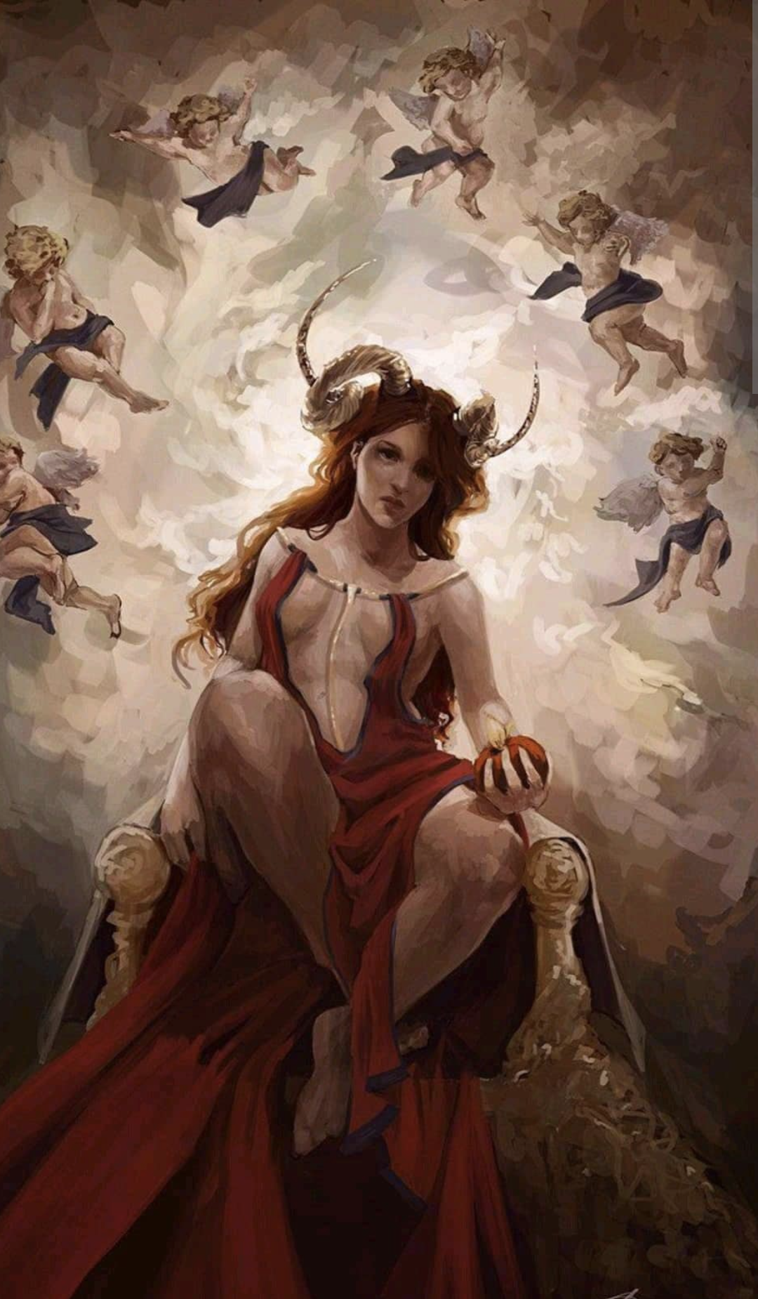
That kind of explains the gold or black dress!https://en.wikipedia.org/wiki/The_dress
I can for the life of me only see it as white and gold, and I have really struggled trying to understand how others can see it as blue and black? I bet the picture you show here is a result of the research the picture of the dress initiated. It can’t be a coincidence that the illusion you posted also is made with dresses.
This is what finally helped me see black and blue:
That has both interpretations, but it didn’t help. I’ve never been able to see white and gold.
So, in the video, when you looked at this:

You saw a dark black and a navy blue? Or is it only in the context of the full image that you’re seeing it as dark black and navy blue?
I see it as obviously black and blue, but i think the idea that anyone sees navy blue is a misconception and leads to much of the confusion. What i instinctively interpret it as is something closer to sky coloured, but clearly blue.
The black is a bit different because it’s very clearly showing up as golden to the camera, but 1) it would be a very fucking ugly colour of lacing, 2) the photo is clearly taken in strongly coloured bright lighting so it’s pretty obviously not the colour it looks like, and 3) it’s a pretty safe assumption that any dark lacing is just pitch black.
This is basically what i intuitively interpret it as looking like in more normal lighting:

I don’t understand why people are arguing about a terrible picture. The colours are blown out. So you could misinterpret them as badly lit white and gold.
Perception is an element of intelligence, and a fundamental part of consciousness.
Were arguing. This happened about 10 years ago, so keep the quality and variance of computer monitors at the time in mind. That, and the average person doesn’t know what color balance/contrast is. Plenty of people don’t even realize that the same image can look different on two different monitors.
The original dress really was white. And for the record, I was team blue.
Reread the wiki page about it. The dress was black and blue.
Wait. For real? I WAS RIGHT?! I was under the impression that I saw it wrong.
Wikipedia says the original dress was blue/black.
Apparently this is the same dress, the colour balance of the one on the left is just that fucked up.

This is the one. People made some color edits to make it more obvious too. That being said I’m still suspicious of anyone who looks at the left picture and can only see black and blue… No way José. I can’t convince my brain to see it even when I know it’s there.
I guess it depends. Are people looking at the left image and going “Yep, that is definitely a dark black and navy blue”? Using a colour picker, the darker areas show up as somewhere around #7a6642, which definitely isn’t the black #231e16 we see on the right. Same with the lighter spots: we’re seeing something around #8596bb, which again isn’t the navy blue of #3a45c3
Quite simply, I cannot make the dress in the left image look like the dress in the right, even if the dress in those images are supposed to be identical.
According to the other comment replying to me, apparently some people see the picture and instinctively think “black and blue” because the background is bright. I can’t see it and never will.
I can’t understand anyone who can look at the left dress and think that it’s a dark picture in the shadows.
All the “explanations” basically say the same thing. Those dress shades appear to be white/gold in the context of a dark or dimly lit room.
Which the photo clearly is not. It’s so damn bright the entire background is washed out, and light is even spilling over from the background over the dress.
I know the explanation very well but none of it can me make it see black and blue. It simply does not look black and blue to me no matter how much context I have. Believe me, I’ve watched videos dissecting it back when it went viral. None of the context can rewire my brain here and I’m not alone with this one.
It was only after following elaborate instructions: change the brightness, squint, and cover up this section of the image, that I was finally able to see a white dress.
As stupid as it was, it was a pretty cool accidental worldwide psych experiment.
The dress was revealed to be, in fact, blue and black.
Anyone with eyes and half a brain would know from the original photo 10 years ago it was black and blue. You can see the severity of the contrast in the photo that would suggest the colour was manipulated.
I still cannot believe this many years later there are still people so absolutely disillusioned that they see “White and Yellow”.
Get your eyes checked, people.
On 28 February 2015, Roman Originals announced that they would make a single white and gold dress for a Comic Relief charity auction.[31]
Oh man, MAJOR missed opportunity there! They sold out of the blue and black ones like overnight, they should have fast-tracked a white and gold version production to hit the shelves ASAP and enjoyed the flood of purchases.
Yes that’s kind of part of the link I gave.
But if you take a color picker, you can clearly see the RGB values from the image to match white and gold.I did the color pocket thing too, and its result was blue and orange. Not super helpful to this particular global controversy, but was worth a shot.
IMO the color of the actual physical dress is kinda moot: photographed (poorly), digitized, and presented to the world on billions of screens with completely different settings for things like color saturation, and the color of the thing that hits our eyes is not necessarily indicative of the color of the original.
The color of the dress in the photo was not the same as the color of the photographed dress.
It was white and gold! sprints away
😋
Correct interpretation: blue and black in an overexposed image
Misinterpretation: yellow and gold in an underexposed image.
The area of the picture that isn’t the dress is washed out in white and the overexposure is even bleeding over top right corner.
Anyone misinterpreting must either be bad with visual context or not understand photography.
tilt your phone until almost parallel to ground and look at it from eye level
I tried, it doesn’t make the slightest difference. But thanks anyway.
this does it for me but I guess depends on the phone screen
It’s such a strange thing. For most of the illusions I can trick my brain to perceive both variants. This one is clearly black and blue. I can see that the black parts isolated can appear golden in the light, but for the life of me I can’t see it any other than blue. Brains are weird.
Brains are weird.
Yes and they are extremely flawed too.
The only reason we think we are smart, is that every other life-form we know of is even stupider.To be fair, we’re the ones who makes the definition and therefore can make them fit our, in many cases, fragile ego. We’re only the most intelligent animal because our definition of intelligence is based on our self.
True, luckily many modern researchers are less biased. A lot of the bias is from religions, that claim that humans are special.
From modern research we now know that we are not special in many many aspects. Apart from being a bit more intelligent, we are clearly the same in more ways than we are different.
In the drawing, the surrounding background and the hard black lines on the lighter version are probably causing that we don’t compensate the light in the same way in both drawings. We are not given the same picture like it happened with the original photo.
I wonder how much of this depended on the differences in device screens. In 2015 there was a lot more variability in display technology, lower resolutions in general and worse color fidelity. OLED was uncommon and expensive, you probably only had an IPS display if you worked in graphic arts, and a lot of people were still using standard LCD monitors backlit with fluorescent tubes, which meant that the black depth was limited and the detail in dark regions of an image was frequently not visible on the screen.
I remember showing a woman at work it, from my phone. She saw it as the opposite to me and another coworker. Me and the other coworker were stunned.
Just looked up the origonal dress pic on my pixel 8 pro. Its still white and gold to me. I’ve only ever seen it as black and blue (without aid) a handful of times since the day it went viral. In sure screens could influence this, but this damn thing stands as a powerful illusion on its own.
To my brain, it could only be white & gold (in reality I mean) if it was in drastic shadow. I iust imagine it not in drastic shadow and it looks blue & black.
I’ll never understand how anyone can possibly see white and gold. You can literally see untinted yellow in the rest of the shop. If the dress was behind some heavy blue filter then how could the rest of the shop be such an overexposed yellow?
You can literally see untinted yellow in the rest of the shop
It’s in a shop? It looks like massively blown out bright sunlight looking out through a doorway. I literally cannot comprehend the idea that anyone actually sees it as blue and black. And I’ve always been pretty good at being able to flip my brain to see either interpretation of other optical (and auditory) illusions.
Even if it was looking outside, sunlight is white. If the color temperature was so off that the sensor recorded white as blue, then sunlight would appear blue as well
Maybe this version with a minor correction to color temperature will help
Because the image is gold and a shade of blue that you can get from white if your white balance is bad enough.
But if the white balance was that far off, then the rest of the store wouldn’t be that shade of yellow
My issue with this illustration vs “the dress” is that in the dress, the background is bright, not a darker blue.
In theory, this illustration just serves to show that nobody should be seeing “the dress” as white and gold. Thy do, and that breaks my brain, but I still feel that there is no logical way for that to be justified (and yes, I read all the research).
when I clicker the link I saw it as black and blue for a split second but all I see now is golden and white 😭😭😭😭
Huh, I checked the talk page out, turns out the guy behind the picture was jailed for trying to kill his wife.
Whitebalance comes to mind. Human eyes perceive the long rectangles’ tint as a base color, i.e. effectively neutral/white.
So yeah, a blue dress in a yellowish light might look the same as a yellow dress in a bluish light.
Human vision is an illusion. It’s mostly inferred, and not representative of how the world actually looks, and I think that’s pretty cool and profound.
Please explain how the world actually looks
I don’t think there’s an objective answer to that
What’s the illusion?
The left and right dress are exactly the same color. However, your eye makes you think the left is black/blue while the right is white/yellow. (Within the shaded area)
I can see the dark detail lines on the bottom of the dress really easy on the right but I can hardly see them at all on the left
The mask overlaying the blue/black dress is lightening the color, causing the faint lines to become fainter, whereas the color is darkened on the masked area on the right, making the lines more distinct.
Oh come on, not this again
Well yeah, obviously… What’s this trying to illude?
You can not imagine that for some people it could be new that the exact same color looks completely different?
This actually helped me.
Delta P
This kills the crab.
This pic makes my brain go “AHHHHHHHHHHHHh”


