random comment to see if i can comment… (im not a bot)
Linux Mint was designed to deliver a smooth landing from Windows, and if you’re the type of guy to have a problem with it, then the entire FOSS communtiy is gonna have a problem with you, because you’re making it harder for people to escape from corporate solutions.
I mean… I used to have a macbook with Linux inside customized to look like Windows 🥸😈
I just want an icon only taskbar at the bottom and a Windows 7-like application launcher. Besides that it doesn’t have to look like Windows at all.
AeroThemePlasma iykyk
Thats fine its your linux.
Yeah gatekeeping is exactly how we get people to try Linux…
Ooh wait, that’s the opposite.
Let people use Linux however they want. That’s the whole point of the OS family, it’s incredibly customisable
There is a heckuva lot to be said for the classic “start” category based app menu, tied to a task bar. XFCE, MATE, OpenBox, all draw from a paradigm established in the Windows 95 design.
Its not a bad design. Personally, I couldn’t get used to anything else (and I’ve tried). My first PC had Win 95 and I’m now on a Plasma desktop.
Microsoft is doing a great job at completely crippling the fuck out of their start menu though, proving once again they have no idea what direction they’re going in.
The fuck? When opening the screenshots and scroll half way through the XFCE4 Screensaver lock screen my monitor starts blinking like crazy.
🎼when a grid’s misaligned with another behind
that’s a moiré
Windows 8… or Windows 11 😬
There is a scale of psychopathy…
XP
Powershell
That’s one of the bad ones
DOS
XP, though? Hell yeah. I still miss that theme.
The Media Center theme was a nice twist on the default XP theme I’ll admit.
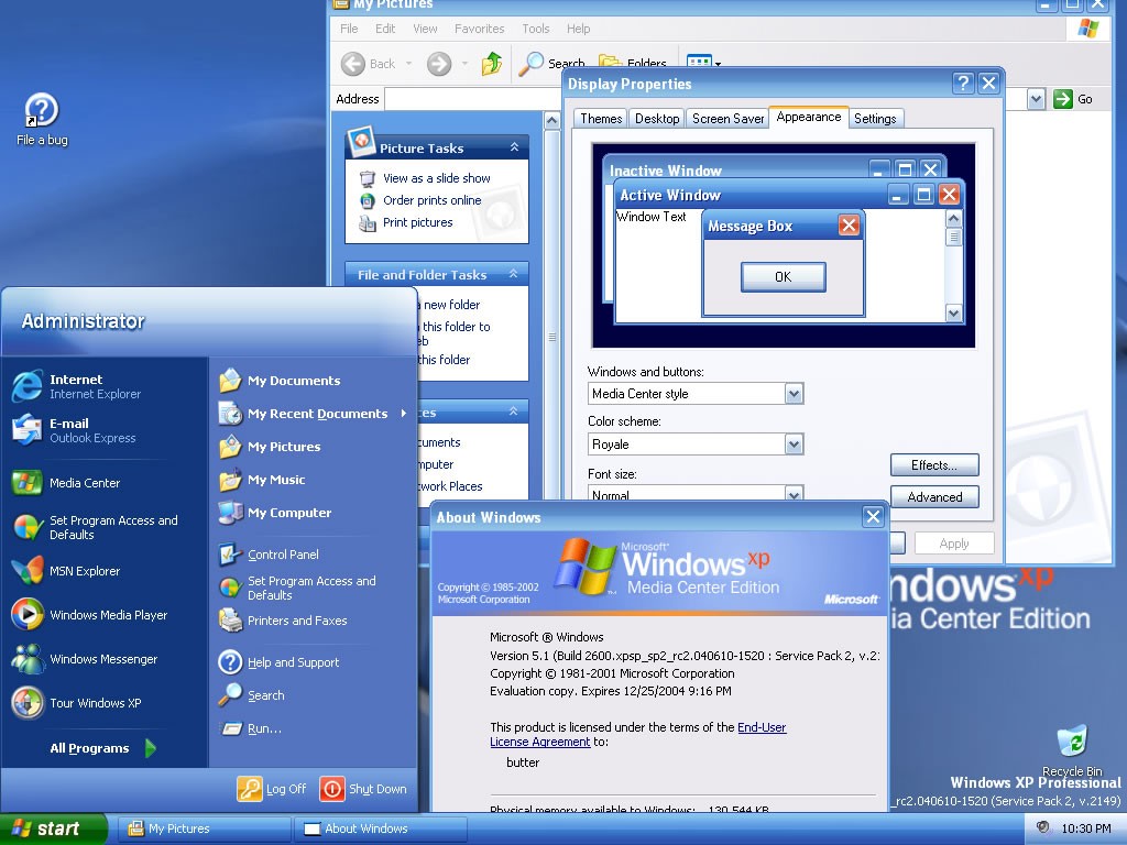
I used Royale Blue for ages, it was super easy to find the installer for and was signed by M$ so needed no UXTheme patch.
There was also Royale Noir and Royale Zune. Noir is a dark theme (Not to be confused with dark mode) and Zune, which was a different shade of black and sported an orange start button. Lastly there was also Royale Embedded which was a darker shade of blue, and had a blue Start button.
98 SE.
Windows 95 blew my mind.
Then windows 98 preview also was amazeballs
Lol, I grew up with the 98se theme and xp theme, and at this point i just think they’re both incredibly ugly. Peak windows desktop prettiness and usability was windows 7 for me.
I disabled the UI stuff where it would look like Windows 2000 from XP until it stopped letting me. Different strokes, I guess.
Put this thing in a VM and then let a scammer remote into it, see what he does.
XP or NT, I’d go back
WindowsME
Psychopath
The Mountain Dew Baja blast of windows releases
Inexplicably beloved by furries?
… no hang on, that actually tracks.
Vista
vista and 7 both look really good, so thats fair
Windows Me!
Honestly, 8 and 8.1 weren’t bad visually (technically a whole different matter). I wouldn’t mind making my WM resemble good old Windows 8, but actually has a sane technical base of Linux underneath it.
It was the one with the weird start menu wasn’t it? Also wasn’t it the one that they started adding the second duplicate ui in a half assed way?
Like where they ended up with 2 control panels
Yeah, Microsoft removed the Start Menu and added full screen tiles, that were widgets that updated with stuff (like news). I don’t remember when the two 2 control panels things happened, Windows had always been a mess to me up to that point. It could’ve been sooner or later, because Windows was built with legacy support in mind.
meanwhile I’m over here making NixOS look like NeXTStep
I tweak my Linux to look like TempleOS.
Do you have the routine that shuffles bible verses?
Of course, 3d sprites included.
I miss some of the explorer features. Specially right click dragging.
I also have some trouble balancing all the smaller storage devices that get used by programs.
I went in the far opposite direction, I tried to make Mint look like an entirely fictional OS, of the sort that might be seen in a video game.
… well you can’t just say that and not provide screenshots, that sounds cool AF
Can’t really take a screenshot of my login screen.

…that’s just the default ubuntu greeter with a different background.
Indeed! Mostly cause I don’t really quite get how to replace the greeter. But I followed up with a separate comment written from my computer instead of my phone. :)
oh hey there we go! i recognise all the components and themes so it’s still familiar, but it’s unique which is nice.
if you really want it to feel like an alien os, give eagle mode a look. that one really wrinkles your brain.
🐢
might not be too good for turtles, no
The left dock is Plank Reloaded and it tucks out of sight when stuff gets maximized. Same for the top bar too. The turtle in both of them is the applications menu. System font across everything is Inter, and the terminal font is Special Elite.


Win 7’s interface was good for a number of reasons and that’s why my UI looks even more like it than the stock Cinnamon themes, which are already a deliberate rip-off.
If that makes people think me a psycho, so be it.