

![finger food. DAY 59 [OC, brainmade]](https://lemmy.blahaj.zone/pictrs/image/182d9e07-9cd0-4c2c-bd53-cecb74ac4e33.webp)
mmmh tasty.
alt image
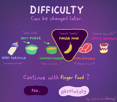
the post is inspired by some baby food charts. certain charts called regular food “challenging” which i thought sounded like a difficulty mode.
i’m somewhat proud of how this looks. been playing some splatoon raiders which has really good UI. it’s fast to understand and use. wonderful.
it also has these “spicy” and “extra spicy” versions of levels where the enemies are literally displayed as having more salt on them. very funny. would have liked to see some other spices as well but oh well that’s hoping for too much i guess.
which one would you pick?
i wish you a wonderful day in which you get to pick the difficulty.
it’s quite low res but I like the color scheme. I do not like the meat overlapping the bananya selection hehe. Also I think the margins between the items are a bit too low so it stands to reason if I were to select something else, it would look weird. Sorry for sounding so negative I swear I like this image ><
Honestly this reminds me of how I had to rehabilitate to food recently and it’s quite accurate to what I had to go through.
I agree on everything actually. Thing is, I just.,. started off at a Reduktion of 400x600 and… didnt wanna expand it. You may notice: the two–pixel size difficulty names are already squeezes together. sooo ye if this were actual game UI, there would be much more spacing and stuff >v<
thanks for the feedback.