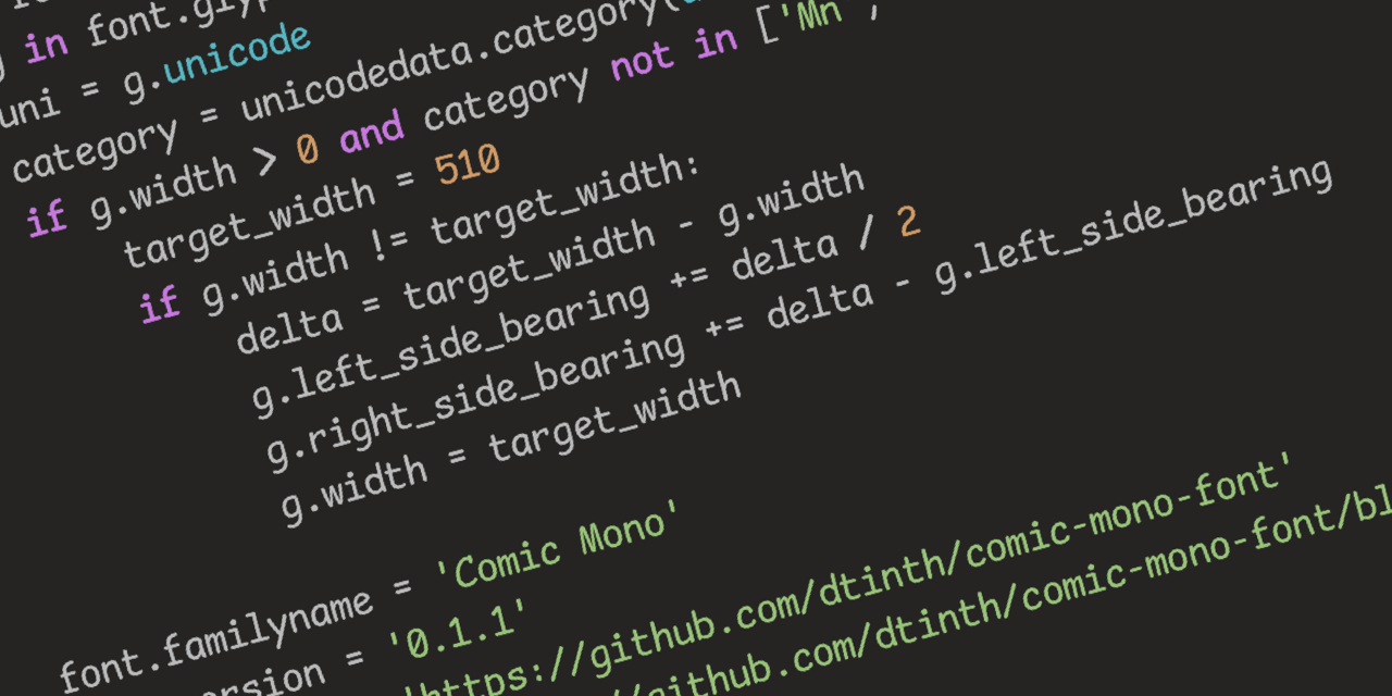
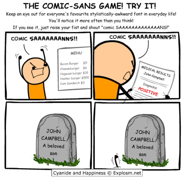
Seriously, though, Comic Sans was originally designed to be legible at the smallest possible font size, and the lack of hard lines makes it easier to read!
I…don’t hate it? Why am I not horribly offended by this?
I feel the same way. I hate that Iike it and am now going to try it.
Friendship ended with font gatekeeping and dogpiling, accessibility is my new best friend
Oh no now I want to build a whole Arch rice around that font.
…no that’s not enough.
we need ComicSansOS
Holy man! If you ever do that. Please post! On unix porn as well!
Is there a Lemmy community for that yet?
https://discuss.tchncs.de/c/unixporn@lemmy.ml There you go.
Does it support ligatures??
Oh no, I was ready to pick up my pitchfork, but that is super legible. Brb, I need to go take a look at myself in the mirror…
I will forever believe the comic sans hate is one of the internet’s seemingly random circlejerks, like hating Imagine Dragons.
There were legitimate reasons from a design standpoint. It’s badly balanced, the spacing is inconsistent…and it was everywhere.
Funny enough, I suspect what makes it a badly designed font might be why some people with dyslexia have an easier time reading with it. The badly balanced, poor spacing, probably made the letters in the font more distinguishable from one another.
If you (or anyone else that’s interested) have the time, I think this article, “Why You Hate Comic Sans,” goes over all of it pretty well.
I recently read a review of 1990s pop aesthetics, and it was probably intentional for reasons that resonate with us again. In the 90s, with the advent of omnipresent computers, organic, amateurish handwriting became really popular, and I think that’s what comic sans is good at looking like.
If you like that, check out Recursive Sans & Mono
I wouldn’t pick it over Fira Code but it has a bit of whimsy to it that reminds me of Comic Mono.
As long as it’s a monospaced font I don’t really care what the font is. (Wingdings excluded)
Might give it a try for a day.
Comic Sans is actually really good for dyslexic people. It’s why I usually use Comic Sans or Comic Neue when I print stuff out for my dad.
There’s also Dyslexie and a similar open source version: https://opendyslexic.org/
I unironically love Comic Mono. I am not dyslexic, I have good eyesight, but I feel like I can read code so much more easily with it versus most other monospaced fonts.
This is cute~! I hated comic-sans when seeing it on lots of tacky corporate and school signs etc. but recently I ironically and then unironically fell in love with its whacky-ness, bold-ness and readability, (I use a Samsung phone, and used PT Mono on the S9, but then future phones blocked custom fonts, so I used one hack-ey Comic-Sans version since my mono ones are so underground no one developed a phone hack - now any font is possible again so I’m using the one below~ )
A few years ago my fav. font became PT Mono, from Google Fonts - cyrilic compatible, it has these angular edges, and swoopy circle curves, so cute <3
THEN there was this font printed on 2011 Pentax Q cameras and lenses that I loved, and couldn’t find the original, but there was something very similar, STALKER1 and related similar fonts
PT MONO
STALKER1
I’ve coded with comic neue https://comicneue.com/ over the last few years. I would definitely recommend it.
I’m intrigued, but it feels so wrong
I’m intrigued, but it feels so wrong
I am in the same boat. Installing…Dog help me.

